
American Family OrthodonticsBBB is now AFO.
And AFO is what?
Our goal was simple. One orthodontic brand would absorb another. BracesBracesBraces would become American Family Orthodontics, and all of its 11 practices would fall in line with that AFO brand experience.
Simple, except that the AFO brand needed to evolve as well.
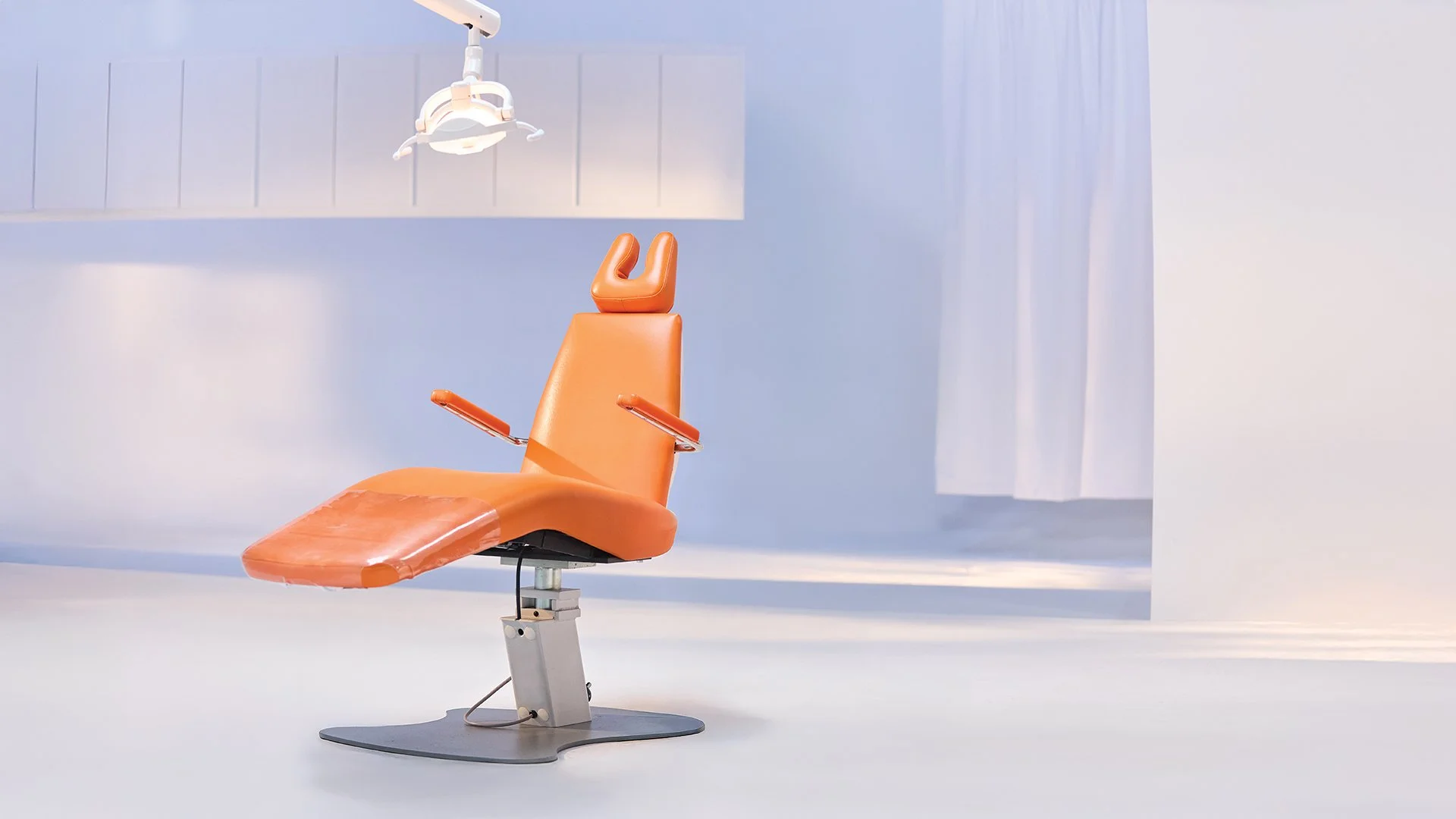
New patients increased by 5% as a result of this campaign.
We achieved a ROAS 4.5x higher than the industry benchmark.
Teeth People.
The AFO brand didn’t have much of an experience built in. It was basically just a logo featuring three abstract teeth people.
That had to change.
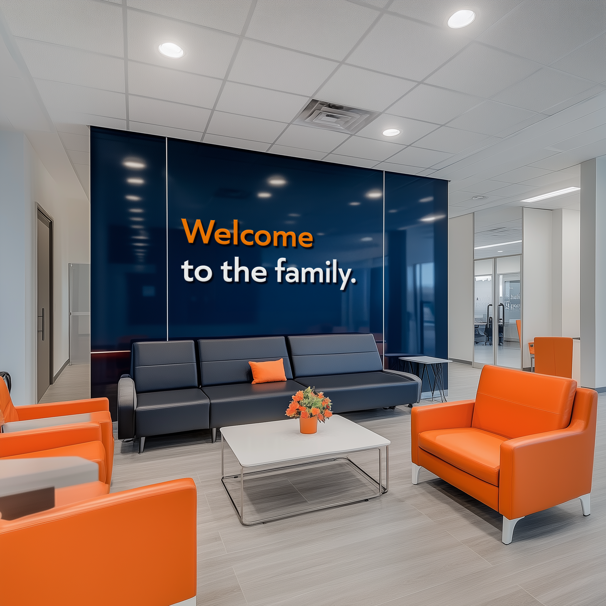
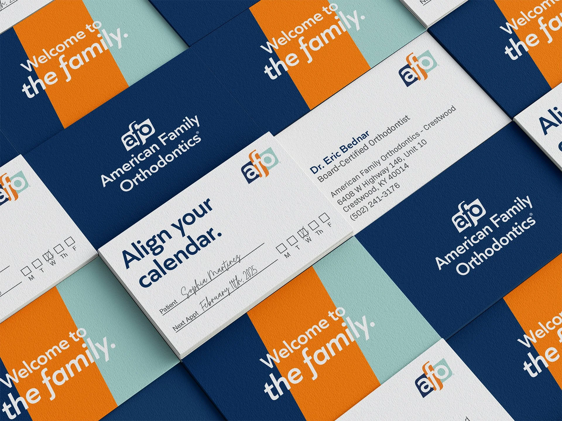
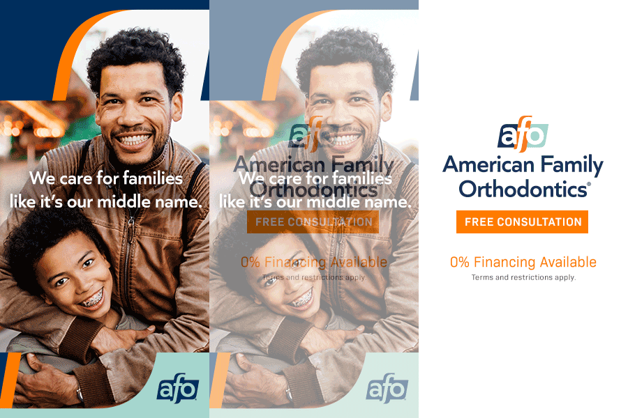
The brand needed to speak to ‘family,’ however that is perceived by our audience. We also needed to build a graphic environment that would allow us to brand any image or space without including the logo.
Our mandate required that we retain or integrate one aspect of the BracesBracesBraces brand that AFO would be absorbing: the orange that BBB was known for.
The visual identity would inform the launch campaign.
Old
NewIt’s about relationships.
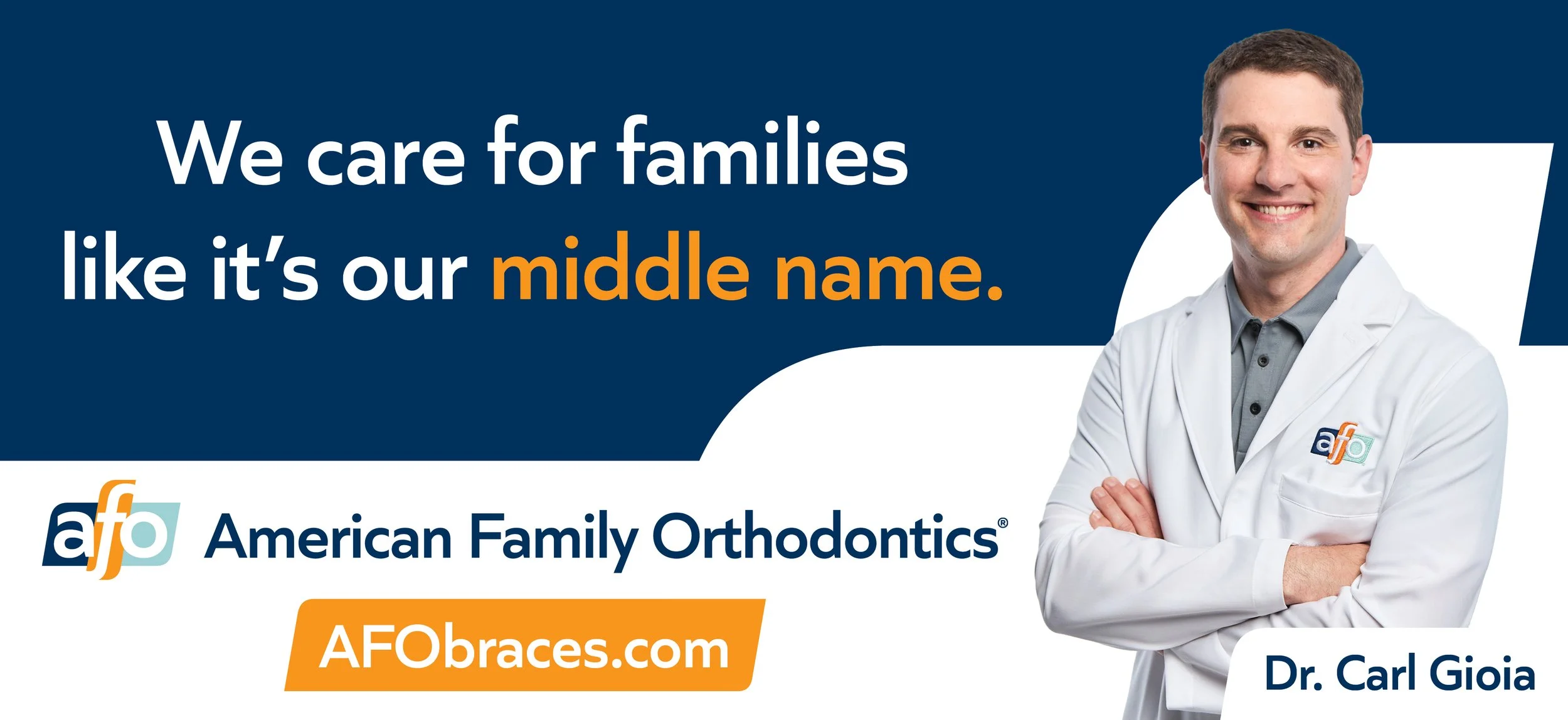
Through our market research, we came to one huge realization: people don’t care much about the brand. What do they care about? Their doctor.
So, I decided we would promote the rebrand as a secondary message and focus on the relationship with the caregivers.
Video ads reached a 98.7% VCR (60% benchmark).
Our work included everything from campaign production to practice remodels resulting in sustained new patient growth exceeding 5%.







BROWSE MORE WORK